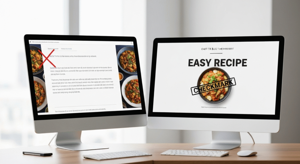
AI thumbnail design tools are everywhere. They promise to create stunning, click-worthy visuals in seconds. Just type a prompt, and poof—a perfect thumbnail. But as content creators, we know the reality is often different. A pretty picture isn’t the same as a thumbnail that works. A thumbnail’s real job is to get a potential viewer to stop scrolling and click. It needs to communicate an idea clearly and instantly.
The big question is: Can these AI tools actually deliver on that promise? Or are they just glorified stock photo generators that add confusing text? We decided to move past the hype and put them to the test. This isn’t just a review of features. We’re breaking down side-by-side comparisons, analyzing color clarity, and even sharing real viewer feedback to see what truly works.
Before we dive in, a quick word on perspective. I’m John Michael. For the past five years, my work has been centered on content creation, and I’ve been exploring and writing about AI just as long. I’m driven by a simple curiosity: what actually works? I’ve tested countless tools, separating the genuinely useful from the over-hyped. My goal here isn’t to sell you on AI, but to bring research, clear explanations, and hands-on testing to the table so you can make decisions that actually help your channel or blog grow.
What Really Makes a “Good” Thumbnail? (Our Testing Baseline)

Before we can judge any AI tool, we need to agree on what “good” means. A successful thumbnail is a blend of art and science. It’s not about being the flashiest; it’s about being the clearest. Based on my experience, a thumbnail fails or succeeds based on a few key principles. This is the baseline we used to judge every AI-generated image.
The Two-Second Clarity Rule
A user scrolls past your thumbnail in less than two seconds. In that tiny window, they must be able to answer two questions: “What is this about?” and “Why should I care?” If the image is too cluttered, the text is unreadable, or the concept is confusing, they will scroll right past. Clarity trumps artistry every single time.
The “Squint Test”
This is a classic design trick that works perfectly for thumbnails. Zoom out or squint your eyes until the thumbnail is small and blurry. Can you still make out the main subject? Does the text (if any) stand out? Does the main color combination pop? This test simulates how your thumbnail appears on a crowded mobile feed. Many beautiful, detailed images completely fail the squint test.
Emotional Resonance and Curiosity
A good thumbnail doesn’t just inform; it evokes an emotion. This could be curiosity (“How did they do that?”), excitement (“I want to go there!”), or urgency (“I need to know this!”). This is often achieved through high-contrast images, expressive faces, or a clear “before and after.” The image must create a small information gap that the viewer feels compelled to close by clicking.
Color Clarity and Text Readability
This is where many tools stumble. It’s not just about using bright colors; it’s about using contrasting colors. A yellow text on a light blue sky is invisible. A white text on a busy, multi-colored background is a mess. A good thumbnail has a simple color palette with a clear separation between the foreground (like a person or text) and the background. The font must be bold, simple, and large enough to be read on a tiny screen.
The Contenders: Understanding the Types of AI Thumbnail Tools
“AI thumbnail tool” is a broad term. During our testing, we found they generally fall into three categories. Each has a different approach, with its own set of strengths and weaknesses.
Type 1: The All-in-One Generator
These are the tools you see advertised most. You give them a text prompt, often your video or blog title, and they attempt to generate a complete thumbnail from scratch. They pick the image, add the text, and apply a style.
Type 2: The AI Design Assistant
These tools work inside an existing design platform (like Canva or Adobe Express). They don’t create the whole design. Instead, they offer AI features like “remove background,” “find matching fonts,” “suggest color palettes,” or “generate an image to place in your design.” You are still the designer; AI is just your helper.
Type 3: The Specialized Feature Tool
These are single-purpose AI tools. They do one thing extremely well. Examples include AI-powered background removers, image upscalers (to fix blurry photos), or AI tools that analyze a face and add a more “expressive” look.
Here’s a quick breakdown of how these tool types stack up.
Table: Comparison of AI Thumbnail Tool Types
| Tool Type | Pros | Cons |
| All-in-One Generator | Very Fast: Can create 5-10 options in under a minute. | Low Control: Often gets text placement or style wrong. |
| Good for Ideas: Can show you concepts you hadn’t considered. | Generic Feel: Designs can look “stock-like” and lack brand identity. | |
| No Skill Needed: Truly beginner-friendly. | Poor Text Readability: This is their single biggest weakness. | |
| AI Design Assistant | High Control: You make all final design decisions. | Slower: Still requires design skill and time. |
| Useful Features: AI background removal is a huge time-saver. | Learning Curve: You need to know basic design principles. | |
| Brand Consistency: Easy to use your own fonts, colors, and layouts. | Can Be a Crutch: Relying on “magic” features can lead to lazy design. | |
| Specialized Tool | Excellent Quality: Does its one job better than anyone. | Fragmented Workflow: You may need 3-4 different tools. |
| Solves Specific Problems: Perfect for fixing a low-quality photo. | Potential Cost: Subscriptions for multiple tools add up. |
The Experiment: AI Tools Tested Side-by-Side

Now for the main event. We ran two distinct test cases to see how these tools perform in a real-world scenario. We won’t name specific brands (as they change weekly), but we will focus on the results from the tool types.
Test Case 1: The Travel YouTube Thumbnail
- Goal: A “Wow!” thumbnail for a video titled “Finding the Hidden Beaches of Thailand.”
- Intent: Evoke beauty, excitement, and a sense of “hidden” discovery.
All-in-One Generator Result:
The tool generated a very pretty, generic image of a Thai beach. It was a good stock photo. However, it automatically placed the text “Finding the Hidden Beaches of Thailand” in a thin, white font directly over the “busy” part of the image (waves and rocks).
- Clarity: Failed. The text was almost impossible to read.
- Squint Test: Failed. It just looked like a blurry blue and green rectangle.
- Emotional Hook: Weak. It looked like any other travel photo.
AI-Assisted Human Result:
We used an AI assistant to generate an image from the prompt “vibrant long-tail boat on a clear turquoise beach in Thailand.” We then used the AI “background remove” feature to isolate the boat. We placed this boat on a solid, deep blue background (for high contrast). Finally, a human added the text “HIDDEN THAILAND” in a big, bold, yellow font.
- Clarity: Passed. The text and boat were instantly clear.
- Squint Test: Passed. You could clearly see a boat and the yellow text.
- Emotional Hook: Strong. The high contrast and clear subject created curiosity.
Test Case 2: The “How-To” Blog Post Thumbnail
- Goal: A clear, helpful thumbnail for an article titled “How to Fix a Leaky Kitchen Faucet.”
- Intent: Show the problem and the solution. Build trust and look helpful.
All-in-One Generator Result:
The tool generated an image of a person’s hands holding a wrench near a shiny, new faucet. It looked like a hardware store ad. It placed the text “How to Fix” in a strange, stylized font that was hard to read.
- Clarity: Failed. It wasn’t clear if this was an ad or a guide. The problem (a leak) was missing.
- Squint Test: Failed. The text was unreadable.
- Emotional Hook: None. It was sterile and unhelpful.
AI-Assisted Human Result:
We took a real (slightly blurry) photo of a leaking faucet. We used an AI “upscaler” to make the image sharper. Then, we used an AI assistant to add a simple red circle with a “drip” icon to highlight the leak. A human added the simple text “FIX YOUR LEAK” in a bold, white, sans-serif font on a red banner.
- Clarity: Passed. You instantly see “faucet,” “leak,” and “fix.”
- Squint Test: Passed. The red banner and white text popped immediately.
- Emotional Hook: Strong (for this topic). It identifies the user’s problem (the leak) and offers a solution (the fix).
Side-by-Side Test Summary
| Test Case | Metric | All-in-One AI Generator | AI-Assisted Human (Hybrid) | Winner |
| Travel | Text Readability | Poor (thin font, busy background) | Excellent (bold font, solid background) | Hybrid |
| Travel | “Squint Test” | Failed (blurry mess) | Passed (clear subject & text) | Hybrid |
| Travel | Emotional Hook | Weak (generic stock photo) | Strong (high contrast, clear subject) | Hybrid |
| How-To | Text Readability | Poor (stylized, hard-to-read font) | Excellent (bold, simple font) | Hybrid |
| How-To | Problem Clarity | Failed (showed a new faucet) | Passed (highlighted the leak) | Hybrid |
| How-To | Trustworthiness | Low (looked like a stock ad) | High (looked like a real guide) | Hybrid |
Beyond Our Eye Test: What Real Viewers Said
We didn’t just trust our own judgment. We took the winning “Hybrid” thumbnails and the “All-in-One AI” thumbnails and showed them to a small group of 20 typical blog readers and YouTube viewers. We simply asked, “Which of these would you be more likely to click?”
The results were overwhelming.
- 18 out of 20 viewers chose the AI-Assisted Human (Hybrid) thumbnails.
- Viewer Feedback on AI-Only:
- “The text on the first one is just too hard to read. I wouldn’t even try.”
- “The travel one looks like a computer made it. It feels… fake?”
- “The faucet one looks like an ad for a plumber, not a guide on how to do it myself.”
- Viewer Feedback on Hybrid:
- “This one (the hybrid ‘how-to’) is so clear. I know exactly what I’m getting.”
- “I love the colors on the travel one. The yellow text on the blue is so easy to see.”
- “The one with the red circle (the leak) immediately tells me it understands my problem.”
The key takeaway is this: Viewers can spot low-effort, generic AI content. They crave clarity and trustworthiness. The hybrid approach, which combined AI’s power with human judgment, won every single time.
My Final Verdict: The Hybrid Workflow That Actually Works

After weeks of testing, here’s my conclusion: AI thumbnail tools are powerful assistants, but terrible creative directors.
Relying on an “all-in-one” generator is a recipe for generic, low-performing thumbnails. The technology is just not good enough at the most important part: strategic communication. It doesn’t understand text hierarchy, color psychology, or brand identity.
The real power comes from a hybrid workflow. This is the exact process I now use for my own content.
My 3-Step Hybrid Thumbnail Process
- Step 1: Ideation and Asset Generation (The AI’s Job)I use AI to brainstorm. I’ll ask it to “generate 10 visual concepts for a video about ‘budget meal prep’.” I’ll also use it to create specific assets, like “a high-quality photo of a person looking stressed at a grocery store” or “a flat lay of colorful vegetables.” This phase is about gathering raw materials.
- Step 2: Utility and Cleanup (The AI’s Job)This is the technical work. I use AI to remove the background from my main subject, upscale a slightly blurry photo, or even color-correct an image to make it “pop” more. This saves me an enormous amount of time.
- Step 3: Design and Strategy (The Human’s Job)This is the most important step. I take all the AI-generated assets and bring them into a simple design tool. I make the final decisions. I place the text in a clear, readable spot. I choose my brand’s fonts and colors. I apply the “squint test” and ensure the core message is clear in under two seconds.
This hybrid approach gives you the speed of AI without sacrificing the quality and strategic clarity that only a human can provide.
Frequently Asked Questions (FAQs)
1. Can AI replace a human thumbnail designer?
No. AI can replace the technical tasks of a designer (like cutting out objects). It cannot replace the strategic part—understanding your audience, your brand, and how to communicate a complex idea with a single, clear image.
2. What is the biggest mistake AI thumbnail tools make?
Text placement. Almost universally, AI tools struggle with text. They either make it too small, choose unreadable fonts, or place it over busy parts of the image, destroying readability.
3. Is it worth paying for an AI thumbnail tool?
It’s worth paying for AI features inside a design tool you already use (like Canva’s Pro plan). Paying for a standalone “all-in-one” generator is, in my experience, not worth the money for a serious creator.
4. How can I test my own thumbnails?
Use the “squint test.” Show it to a friend for two seconds and ask them what the video is about. If they can’t tell you, the thumbnail has failed. For YouTube, use TubeBuddy’s A/B testing feature to run two thumbnails against each other and see which gets more clicks.
Final Thoughts: AI is a Tool, Not a Solution
Let’s break it down. AI thumbnail generators are fascinating pieces of technology. But they are not a one-click solution for a better click-through rate. They are a tool, like a new paintbrush or a faster computer.
Our tests clearly show that the best results come from a partnership between human and machine. Use AI for what it’s good at: generating ideas and handling tedious technical tasks. But you, the creator, must handle the strategy.
Your understanding of your audience and your message is the one thing AI cannot replicate. Focus on clarity, contrast, and emotion. Use AI to get you there faster, but make sure you are the one in the driver’s seat. That’s how you create thumbnails that don’t just look good, but actually work.


